

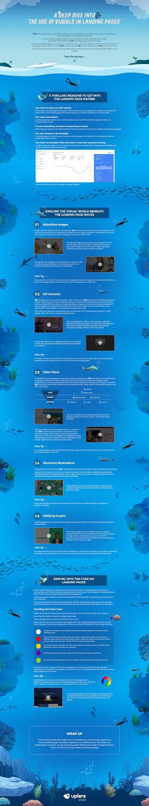
Tapping on the emotional instinct of your prospects and customers is imperative if you want your landing pages to convert and bring you better sales. Visuals can be a powerful element that can make your visitors smile, share valuable information, inspire the readers, and encourage them to make the purchase.
Take a look at this landing page inviting the visitors to a webinar that would discuss the future of retail-borderless commerce. It has perfectly combined text, visuals, and CTAs to encourage the readers to take action.

That said, let’s move on to exploring the world of visuals in landing pages.
1. Use relevant imagery
When your content is accompanied by relevant images, readers find it easier to grasp the message and make up their mind to complete the purchase. The key to using imagery is that if a message can be conveyed with the help of an image, there is no need to have a wall of text to explain it.
Moo has gone a step ahead and incorporated the principle of storytelling in their email landing page.
While the email shows an interesting GIF of a toaster with the CTA “Push the lever”, the landing page continues the story and displays a toast with toaster marks of 15% to promote their 15% off and coupon code.


2. Grab attention with GIFs
GIFs are the perfect substitute to videos as they emulate a video-like experience without any major impact on the loading speed of the landing page. According to GIPHY, 500 million active users spend close to 11 million hours in viewing GIFs on their channel which demonstrates the love for GIFs.
Just make sure that the size of the GIF does not go over 1MB so that your page does not take too much time to load.
3. Let videos do the magic
So many companies have started using videos in their landing pages to make the message more impactful for the readers and showcase your products or services effectively. You can either use the videos in the background or have a different section for the video followed by a sign-up form and CTA.
If you want to stand out from the crowd, you can even try out personalized videos on the landing pages. These videos can be easily created with the help of tools like Hippo Video in which you create a video template with placeholder text and then edit it with tailormade content according to the reader’s preferences.
4. Take help of illustrations
Illustrations are way more convenient to create when compared to videos or GIFs. Another advantage of these modern images is that they have a great visual appeal too. They can be used to symbolically represent an idea through graphics and explain your offerings to the visitor.
5. Harness the power of graphs
Often, marketers need to showcase complicated statistics on a landing page. Graphs can help you with this.
Here are some ways in which you can use graphs to their maximum potential.
i. Take help of scatter plots and treemaps to display huge set of information.
ii. If you want to show trends over a decade or two, use line charts or bar graphs.
iii. Pyramids and pie charts work well if you want to show the proportion of elements.
6. Choose the right colors
Whenever you sit to strategize your landing page design and visual elements, pick the right colors according to your business type and industry. For example, if you are a premium brand, black and white would be the perfect choice for you. Remember Apple?
On the other hand, if you are an FMCG brand, red would work better for you. (Example: McDonald’s)
Green stands for tranquility, health, and good luck which makes it a good choice for brands that are related to growth.
To learn more about how to use the appropriate visuals, colors, and CTA in your landing pages, head to the insightful infographic by Email Uplers: A deep dive into “the use of visuals in landing pages”.
IMAGE EMBED CODE
<a href=”https://email.uplers.com/infographics/landing-page-visual-elements/” target=”_blank”>
<img src=”https://email.uplers.com/infographics/landing-page-visual-elements/images/embed.jpg” alt=”How to Use Visual Elements in Landing Page to Boost Conversions” /></a>
Source:<a href=”https://email.uplers.com/infographics/landing-page-visual-elements/”> How to Use Visual Elements in Landing Page to Boost Conversions </a>
About the author
Kevin George is Head of Marketing at Email Uplers, one of the fastest growing custom email design and coding companies, and specializes in crafting professional email templates, PSD to HTML email conversion and free responsive HTML email templates in addition to providing email automation, campaign management, and data integration & migration services. He loves gadgets, bikes, jazz, and eats and breathes email marketing. He enjoys sharing his insights and thoughts on email marketing best practices on his blog.