

Do colors really matter when you are designing your business logo? The answer is a resounding YES! Colors do matter, but why? Because we human beings love color and using color to represent your brand or business is an important factor in receiving the traffic and reputation that business owners seek.
Logo design is a huge factor for companies. A unique logo with colors is one way for your business to stand above all the others. Without the use of colors, it would just be another logo in a vast sea of business logos and could end up being overlooked which is not the way you want your business to be remembered. Experienced and professional logo designers will know what colors should be included in your logo design.
With that said, there is truly color psychology out there that can help you make your logo stand above all the rest. Humans associate colors with different emotions, and designing your logo with specific colors in mind can bring forward those emotions. The end result is more traffic, revenue, longevity, reputation, and more as your business makes its way into the world.
Experts at LogoMyWay say that different colors can bring about different emotions. As a matter of fact, studies have been done with regard to how people are affected by different colors, and how your brand will be looked at with its use of colors. Many times, people make a judgment of businesses within just a few seconds, and much of this judgment has to do with logo design and colors used for it.
What this can mean to you as a consumer is that by judging a businesses logo and color usage, you can subconsciously make decisions on which of these logo design companies to choose, where you prefer to shop and what brands you prefer to purchase along with those you trust as opposed to ones you do not trust. Much of this influence, whether realized or not, is because of a brand’s choice of color usage on their logos.
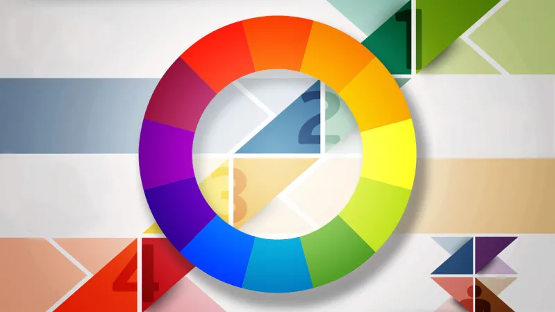
What do the Different Colors Mean on Business Logos?
Think about it this way, most everyone knows what certain colors of roses mean. For instance, Red is for love or passion, Yellow is for friendship, and so forth. Colors that are chosen for logos often have various meanings depending on the company they are being used by, but they still elicit most of the same emotions from consumers. Below are a few examples of the different meanings of colors used for business logos.
Red–As everyone knows, red stands for passion and anger. But it can also be defined as exciting, playful, youthful, modern, and even loud. If your business or brand is one of these than red should be the primary color on your logo. But if your brand is more classic, mature, or serious, then you should choose a color more closely related to your type of brand.
Yellow–The color of sunshine, and it always brings a smile to your face. Yellow is right up there, in your face, wanting to be noticed. It’s also a fun and carefree color, bringing about fun emotions and playfulness. Yellow can also be associated with friendliness, cheerfulness, and energy. If you really want your brand to be noticed, then yellow is the way to go.
Blue–The color blue is a long-time classic and favorite color of companies, not to mention consumers. As a matter of fact, the color blue and its various shades often appear in a brand’s logo. About half of the logos out there include the color blue. Blue stands for trustworthiness, maturity, and blue is sure to make your business one that is taken seriously.
Orange–Orange is playful, invigorating, and stands out in a crowd of dull colors. Just like yellow, if you want your brand noticed consider using orange in your logo design and watch it bring a smile to your face.
Green–The color green is versatile and those brands who are into finance, or gardening should choose green for their logos. While it may not bring about a lot of emotions, green is still a pretty popular color especially for those brands that say they are all natural, and environmentally safe.
Purple–The color purple has been known to elicit creativity and knowledge. No doubt the color purple is rather popular with companies such as Lady Speed Stick, Monster, Cadbury, and so many others. It can be both feminine and masculine.
![]()
Pink–Of course, everyone knows the color pink represents a girly nature, but the various hues of pink from light pink to dark magenta are also very versatile. Pink is perfect to bring out the youthful exuberance of your brand as well as its luxuriousness.
Brown–The color brown and all of its shades are usually considered masculine, serious, and rugged. Brown isn’t used very often, so by utilizing it, you will be noticed and stand out against that sea of logos out there.
Black–Welcome to the dark side, black is modern, serious, crisp, and clean. A few other words come to mind when considering black like luxury, beauty, determination, and looking slick. As the old adage says, once you go black you’ll never go back–to colored logos.
White–It doesn’t get much more neutral than the color or non-color of white. One thing to remember about white, it can pair up nicely with any other color on the color wheel. Economical, crisp, and clean also come to mind and it works wonders as a secondary color on your logo.
Gray–From light gray to dark gray, it is the middle ground of being classic, mature, and serious. Feel like being more mysterious? Dark gray can help you achieve being mysterious.